Python
> matplotlibの使い方
モジュールをインポートする
matplotlibでグラフを描画するためには、matplotlibのpyplotというモジュールをインポートする必要がある。
import matplotlib.pyplot as pltまた、データの生成やファイルの読み込みでnumpyを使用することが多いので、併せてインポートする。
import numpy as np
# データの生成
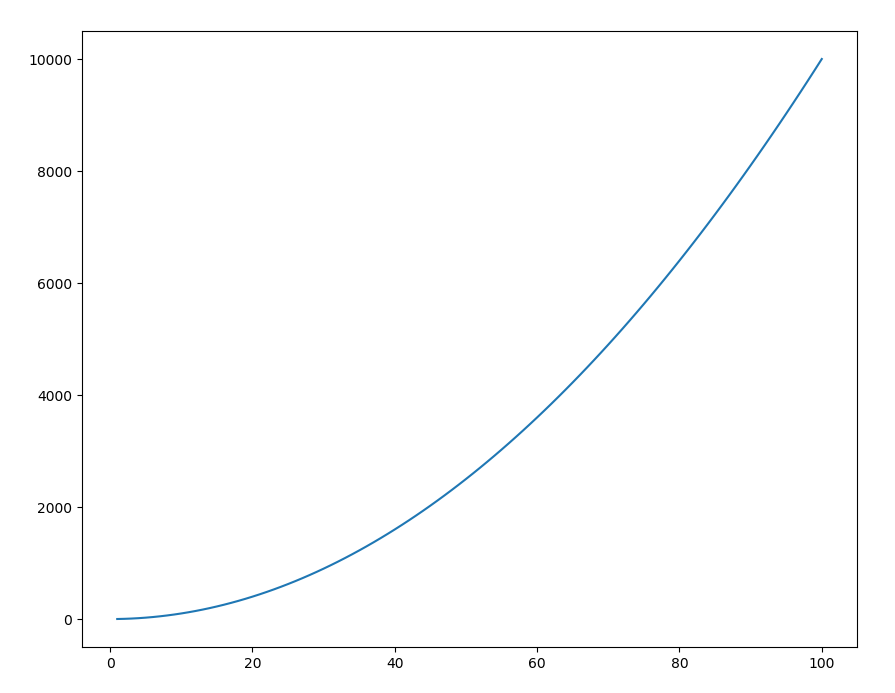
x = np.linspace(1, 100, 100)
y = x ** 2
ここでは2次関数のグラフを描画するためのデータを、xの範囲が[1, 100]となるように作成した。 あとはxとyを用いてプロットをするだけである。
グラフを描画する
作成した配列データをグラフにプロットする方法は2つあるので、それぞれを紹介する。
Pyplotインターフェース
Pyplotインターフェースは全ての描画設定をpltを用いて行う方法である。
直感的な操作ができるので理解しやすいが、後々のことを考えると次項のオブジェクト指向インターフェースを用いる方がよい。
プロットにはplt.plot()を用いるだけである。
plt.plot(x, y)
plt.show()
plt.show()を実行するとグラフ画面が表示される。
下の画像のようにプロットされていれば成功である。
オブジェクト指向インターフェース
オブジェクト指向インターフェースは、グラフの階層構造(オブジェクト)を作成して描画を行う方法である。 最初は慣れないかもしれないが何かと便利なので、以降はこちらの方法で説明を進めていく。
# Figureオブジェクトの生成
fig = plt.figure()
# Axesオブジェクトの生成
ax = fig.add_subplot(111)
# プロットと描画
ax.plot(x, y)
plt.show()
描画のためには、グラフのフレームとなるFigureオブジェクト(fig)、描画領域となるAxesオブジェクト(ax)を生成する必要がある。
Axesオブジェクトに対してax.plot()を用いることでプロットができる。
なお、この実行結果もpyplotインターフェースと同じものとなる。
図の体裁を整える
ここまででグラフのプロットはできるようになったが、軸タイトルや凡例などは表示されていない。 図の体裁の基本的な部分を整えるためのスクリプトを用意したので、はじめはこれを利用してほしい。 より詳しい設定はmatplotlib詳細設定に委ねるので、そちらを参考にしてほしい。
import numpy as np
import matplotlib.pyplot as plt

###########################################################################
# rcParams setting
###########################################################################

# layout
plt.rcParams["figure.figsize"] = [16.0, 12.0]  # [width(inch):height(inch)]
# plt.rcParams["figure.dpi"] = 300
plt.rcParams["figure.subplot.left"] = 0.14     # padding-left
plt.rcParams["figure.subplot.bottom"] = 0.14   # padding-bottom
plt.rcParams["figure.subplot.right"] = 0.90    # padding-right
plt.rcParams["figure.subplot.top"] = 0.91      # padding-top
plt.rcParams["figure.subplot.wspace"] = 0.30   # padding-width-space
plt.rcParams["figure.subplot.hspace"] = 0.30   # padding-height-space

# font
# plt.rcParams["font.family"] = "serif"
# plt.rcParams["font.serif"] = "Times New Roman"
plt.rcParams["font.size"] = 18

# ticks
plt.rcParams["xtick.top"] = True
plt.rcParams["xtick.bottom"] = True
plt.rcParams["ytick.left"] = True
plt.rcParams["ytick.right"] = True
plt.rcParams["xtick.direction"] = "in"
plt.rcParams["ytick.direction"] = "in"
plt.rcParams["xtick.minor.visible"] = True
plt.rcParams["ytick.minor.visible"] = True
plt.rcParams["xtick.major.width"] = 1.5
plt.rcParams["ytick.major.width"] = 1.5
plt.rcParams["xtick.minor.width"] = 1.0
plt.rcParams["ytick.minor.width"] = 1.0
plt.rcParams["xtick.major.size"] = 10
plt.rcParams["ytick.major.size"] = 10
plt.rcParams["xtick.minor.size"] = 5
plt.rcParams["ytick.minor.size"] = 5

# axes
plt.rcParams["axes.labelsize"] = 24
plt.rcParams["axes.labelpad"] = 20
plt.rcParams["axes.linewidth"] = 1.5
plt.rcParams["axes.grid"] = False
# grid setting
# plt.rcParams["grid.color"] = "black"
# plt.rcParams["grid.linestyle"] = "--"
# plt.rcParams["grid.linewidth"] = 1.0

# legend
plt.rcParams["legend.loc"] = "best"
plt.rcParams["legend.frameon"] = False
# plt.rcParams["legend.framealpha"] = 1.0
plt.rcParams["legend.fontsize"] = 20
plt.rcParams["legend.borderaxespad"] = 1.0
plt.rcParams["legend.facecolor"] = "white"
plt.rcParams["legend.edgecolor"] = "black"
plt.rcParams["legend.fancybox"] = False
# plt.rcParams["legend.markerscale"] = 2


###########################################################################
# Plot
###########################################################################

# data
x = np.linspace(1, 100, 100)
y = x ** 2

# layout
fig = plt.figure()
ax = fig.add_subplot(111)

# plot
ax.plot(x, y, linewidth=3, color="blue", label="Data")

# other settings
ax.set_xlabel("X-label")
ax.set_ylabel('Y-label')
# ax.set_xlim(0, 5)
# ax.set_ylim(0, 25)

# legend
ax.legend()

# save
plt.savefig("plot.png", dpi=300)